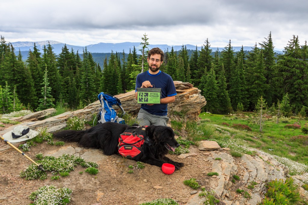
About Matt
In my years, I have worn many hats. I am a photographer. I am a hiker, backpacker, a traveller, and an explorer. I am a scientist and a naturalist. I am an educator. I am a perpetual student, always learning about the world and its people. Almost everything I do stems from my love of the natural world. As a scientist, I study the behavior, ecology, and evolution of animals (I like plants, fungi, and microbial organisms too!). As a photographer, I’m drawn to the immense biodiversity and landscapes that have been carved out by millions of years of uplift, erosion, and other geological processes. As a traveler, I’m fascinated by the various cultures and their relationships with the natural world around them. This website is my place to share my photography, ideas, and experiences. So have a look around and enjoy my world.
What is “mineral2?”
Mineral2 has been my web alias ever since my first AOL account in the mid-90’s. There are so many Matt Singers out in the world, that finding user names and open URLs associated with my actual name is nearly impossible. So, I’ve kept the mineral2 identity ever since. The name comes from my rock and mineral collecting hobby that I started in grade school ever since discovering fossils in the undeveloped section of my neighborhood. I still collect rocks to this day.
Recent Stories
-
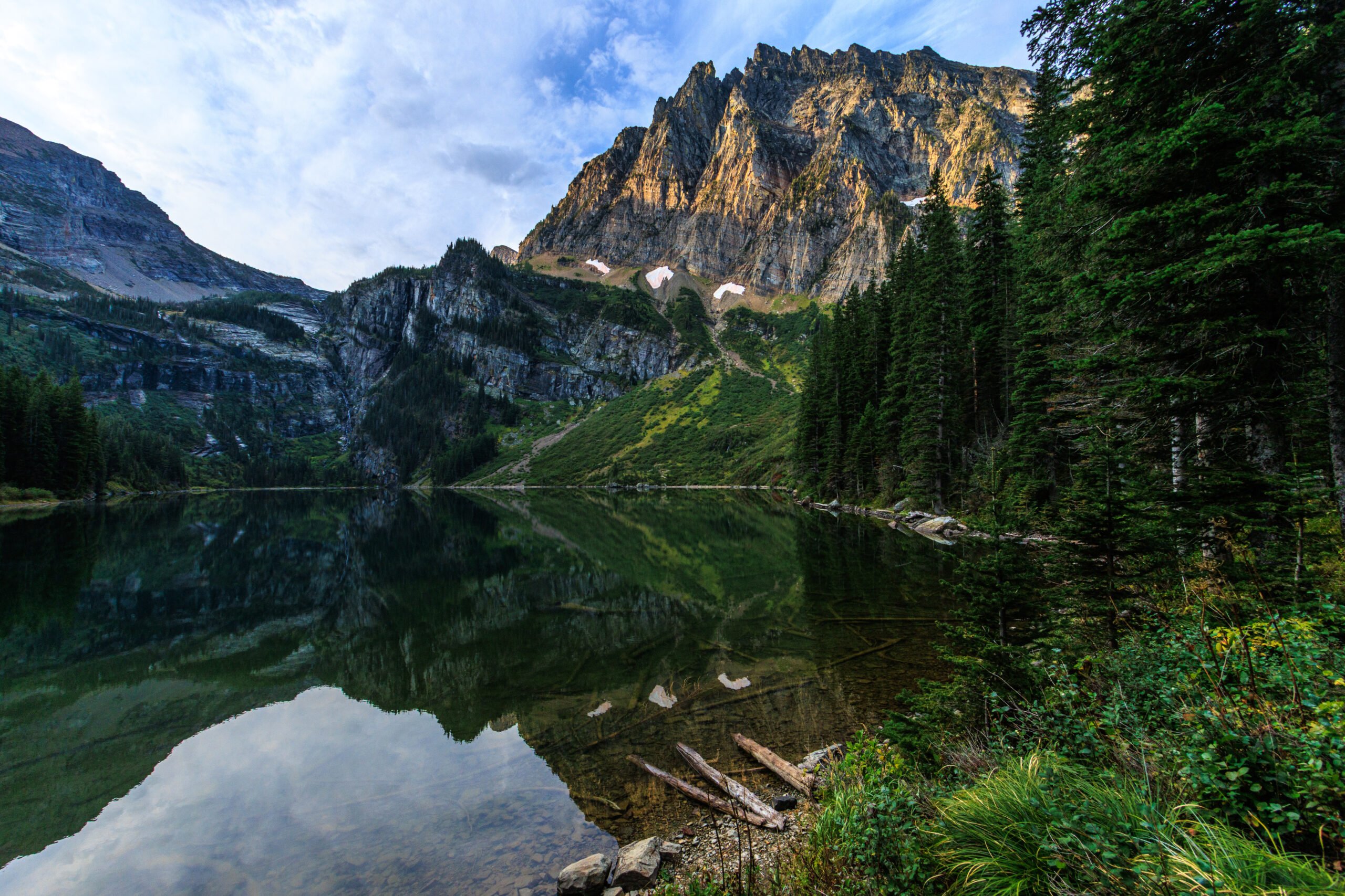
Backpacking: Granite Lake
When I first moved to Idaho, I would study Google Earth to look for places to explore. The Cabinet Mountains across the border in Montana stood out with its high peaks and alpine lakes. The largest of these is Granite Lake and it sits beneath one of the highest peaks in the range. I never did make it during my grad school tenure. So when we decided to go out for one last trek this year, I pitched this, and the next thing I know, we were on the road headed toward Libby to get to the trailhead. On paper,…
-
Backpacking … for real
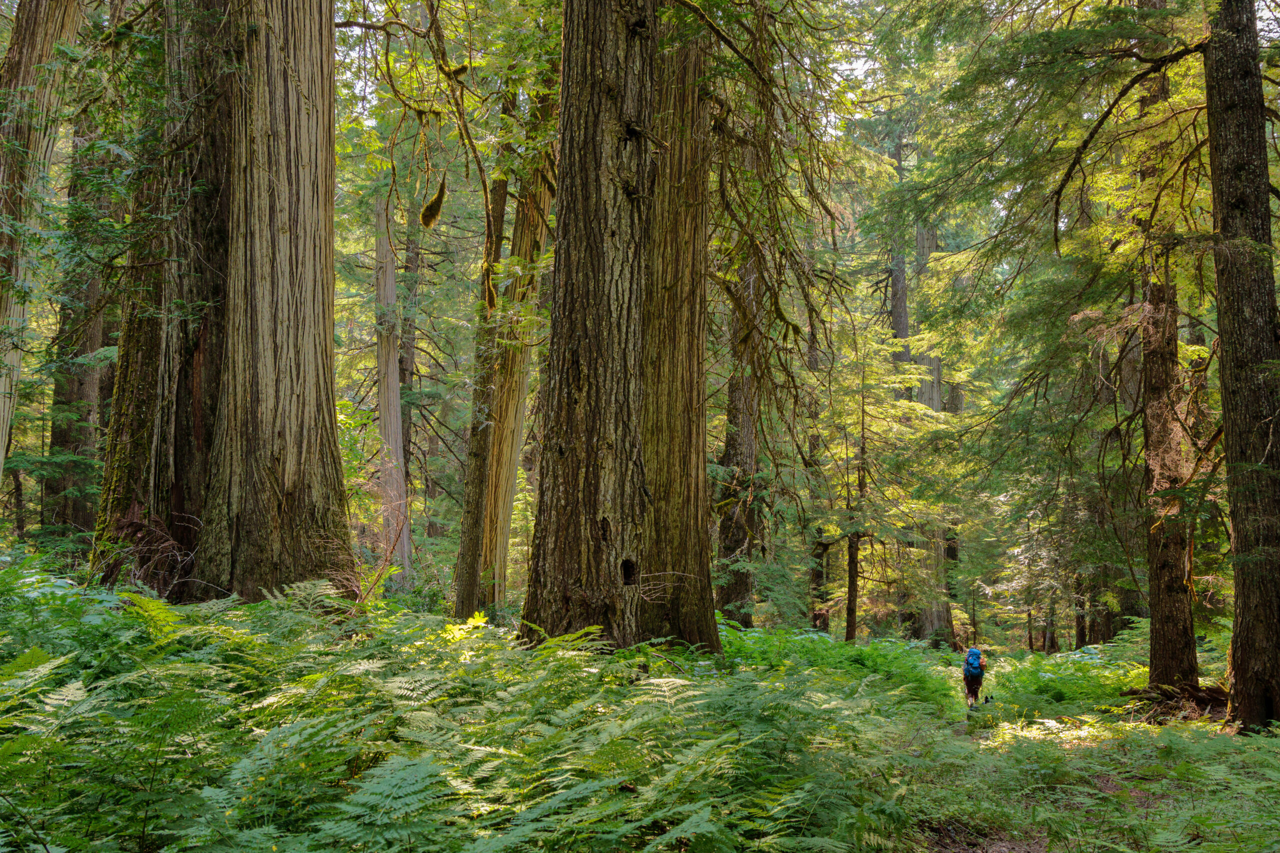
After our jaunt to the fire tower on Shorty Peak, we decided to go out for a more conventional backpacking trip – the kind where we bring everything we need with us, including the shelter. We chose the upper priest river, a relatively mild trail to get us started. This trail goes 8 miles along the upper Priest River through lush old-growth forest, ending at a waterfall just miles from the Canadian border. In many ways, this trip reminded me of backpacking in the eastern US. If you’re looking for grand mountain views and high alpine lakes and meadows, this…
-
Backpacking… sort of
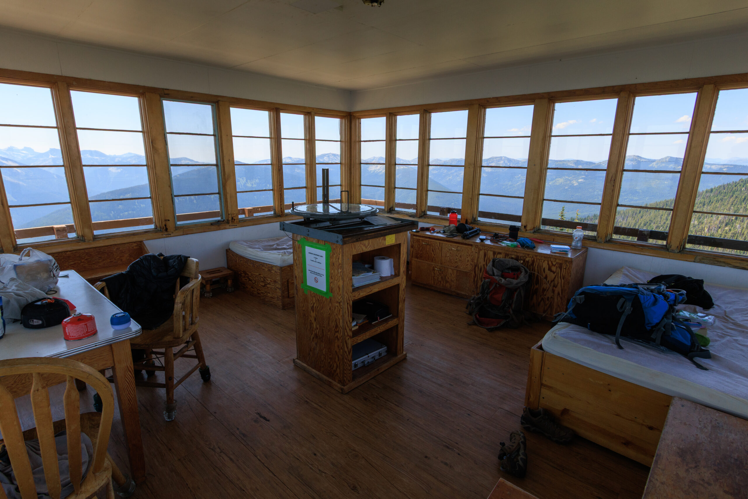
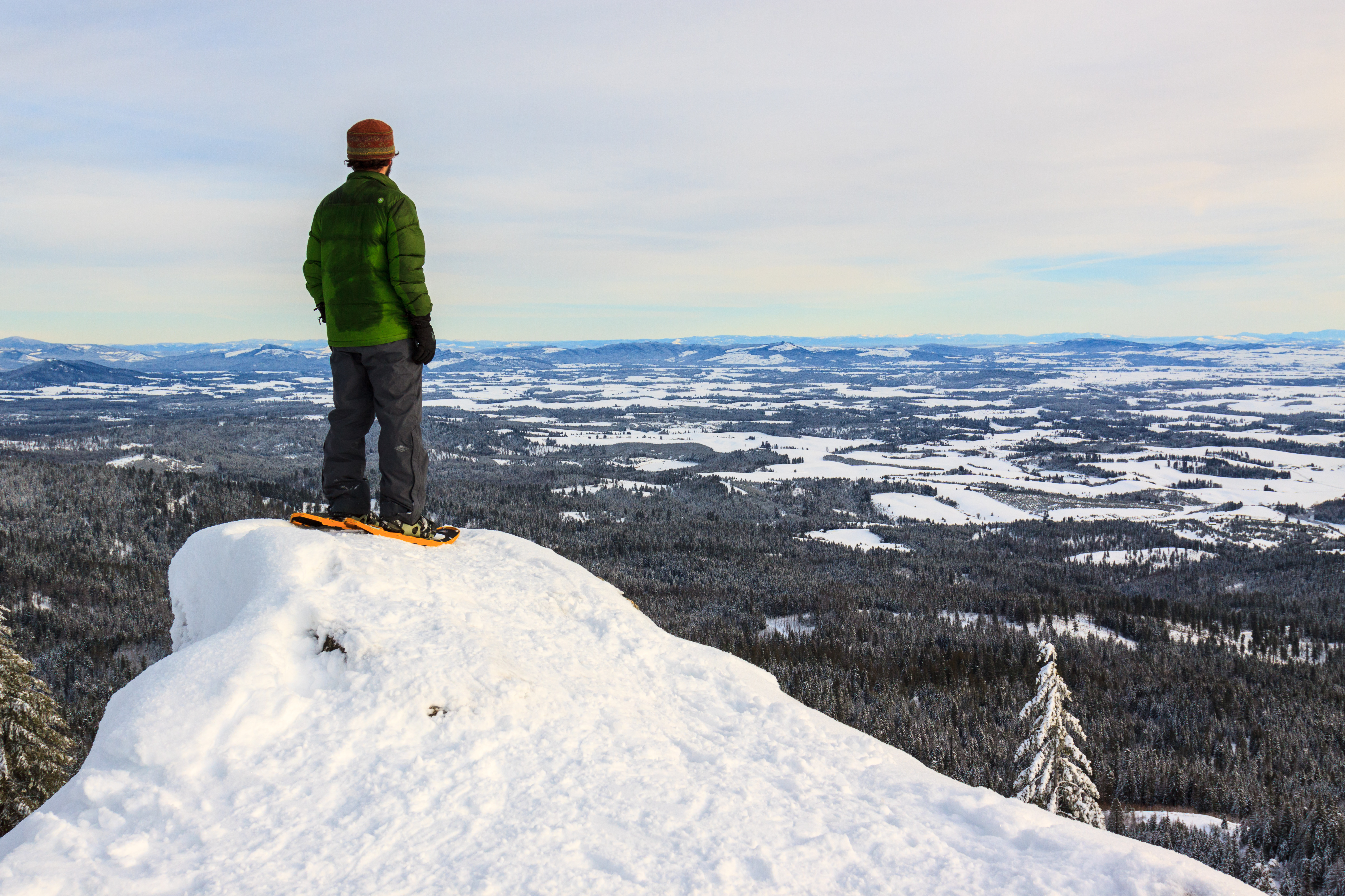
It’s good to be back on the trail. Backpacking has been absent from my life for quite some time, and I am excited to change that. On this trip, I hiked 2.5 miles and 1500 feet up to a forest service fire lookout that has been converted into a cabin for rent. Shorty Peak tops out at an elevation of around 6500 feet above sea level with a view that is as spectacular as it sounds. The mountain is located in Idaho’s Selkirk Mountains on a ridge adjacent to the ridge that hosts the US-Canadian border. When Heather found that…